 Follow Us on Google
Every time we wear clothes, they sometimes represent the stories we have to share. Every pin, needle, stitch, and thread used by the fashion designer carries each of our identities, memories, and sense of belonging. When you see fashion runways in Paris, for instance, they stand for something that is beyond art and fashion. They represent human essence.
Kenneth Ize understands this fashion concept. They recently presented their work at the South London Gallery. It was a brilliant showcase. The performance, dialogue, everything. Interestingly, they combined their work with Lagos, Peckham, Repeat: Pilgrimage to the Lakes, and also collaborated with Boy. Before. Friend.
The essence of this article is to highlight and critique some of the outfits that these talented designers have in their 2025 collection. Stay with me as I critique them.
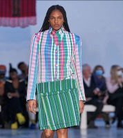
This collection has a really nice set of clothes. The first cloth here is cardigan-looking. The blend of colours in the top is nice. That is, the combination of pink, blue, green, and white. The designer also did well by making the skirt all-out green.
There’s no way somebody would put on this cloth and not appear confident.
But something doesn’t look just right; having multiple colours all at once. I understand the need to play with colours and be creative, but if an average Nigerian, who is not exactly fashion inclined, sees such, they may feel a bit off about it.
When I take a very good look at this outfit, one thing stands out to me: the colours. Much like the first one, this one also has a nice blend of colours. The design and prints kind of look like a ‘Ghana Must Go’ design, though. All the same, the blue, red, beige, and black stripes look very appealing.
This cloth is well-patterned. There’s no way a person would not wear this outfit and not look like someone with proper swagger. But there is something important I think the designer should take note of; let there be a little break in the outfit rhythm. So that whoever models with this can breathe easily.
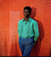
At first glance, you can easily see the beauty of this outfit. The green, navy blue, and red colour backdrop is very nice. The black circle-shaped motifs give the shirt a nice touch. It looks a bit like a suspender, which makes the outfit go in the direction of formal and informal. This even gives the top and trousers a good link.
Other News
I think the designers should consider making the palette soft. If it is done this way, the outfit will still look vibrant.
Number 4 in this collection is another vibrant-looking cloth. I like to call something like this a striped one with a pulse. What that means is that the outfit shows some level of rhythm. From the shirt’s colour, to the shiny, white necklace, to the free-flow, everything is so on point. Of course, the addition of the V-neckline is the icing on the cake. The model used to even advertise the outfit has a good countenance.
But I would like to point out something: the stripes could have been better. The designer should give more focus to it and use brighter colours. Also, I get the need to make it free-flowing, but still, slim-fit it a bit. Lastly, I don’t think this outfit will look good on somebody who is fatter than this. So, the designer should put that into consideration.
This one is just something else. It reminds me of the coat of many colours which was worn by Joseph in the Bible. I can see the vertical stripes of green, purple, black, yellow, and grey. Even the collar has a good colour combination. But here’s the ‘wahala’; when outfits like this have so many attributes, it would look like whoever wears it is seeking attention. So, the best thing to do in this case is to tone down the jacket’s clash of vertical and horizontal stripes.
From what I have seen so far, Kenneth Ize’s 2025 collection is brilliant. It is not in any way mediocre. The fact that the designer even transformed the South London Gallery into a nice backdrop for the collection is just something else. I doff my hat to him! The brand has somehow found a way to bridge the gap between Lagos and Peckham. I like the approach. It was thoughtful. Overall, though, I like how the designer used fashion as a way to explore and give many thanks to cultural roots.
I want to believe Kenneth Ize has many inspirations. One of them that is visible to the eyes is how he mashed up ‘old and new’ in this collection. How the brand blended Yoruba fabrics and modern style is like something only a scientist will be capable of achieving in his lab. The partnership with Boy.Brother.Friend now makes more sense. It is indeed interesting now to see.
It is no news that African luxury brands are redefining global fashion today. We watch the news, we listen to the radio, we surf the net, and we can all see clearly that Kenneth Ize falls under this category. Look at Orange Culture, for instance; you can see how that brand uses silhouettes, storytelling, gender-neutrality, etc. Now, look back at Kenneth Ize, and see nothing but pure creativity and artistry.
Everyone who knows their fashion onions knows Maki Oh. She’s a designer who uses adire and good detailing in her styling. Kenneth Ize, on the other hand, is bolder. they use stripes, grids, and momentum. When you use such qualities even as an amateur, nobody would want to ignore your work.
There is also Lisa Folawiyo, who usually mixes Ankara with tight beads. That is her own style. Kenneth Ize is the opposite. they usually strips mixtures and gives room for raw textiles to do the work.
I have carefully critiqued this collection, and I can say for free that it has positioned Kenneth Ize as a cultural voice, instead of just another regular fashion house. With this collection, it is evident that African fashion can go toe to toe with some of the big names in the industry. I look forward to seeing more of their works.